This project required a keen eye for type and interesting layouts.
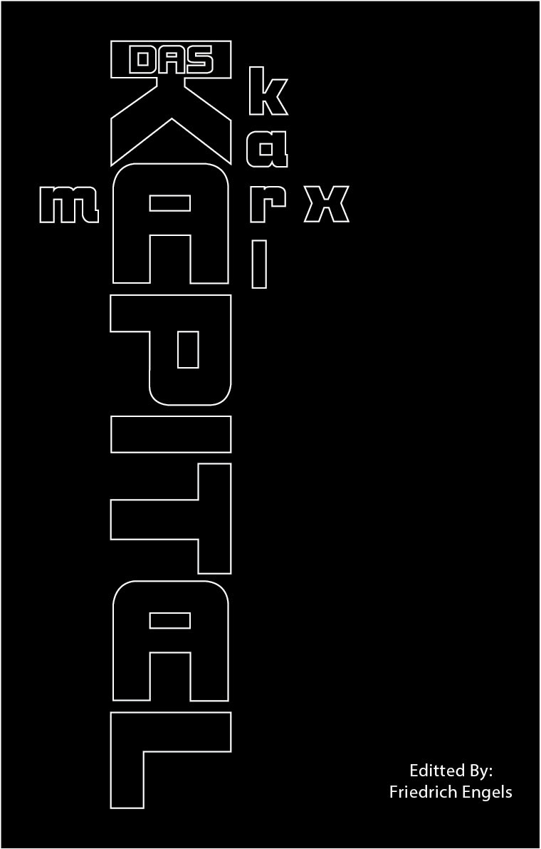
Proposed typographical layout
The challenge was to visually correlate the element of the book and it's title "Das Kapital" purely by typographical layout. As you can see I've tweaked the orientation of letters to give it visual appeal but i've made sure to keep the readability factor in mind.
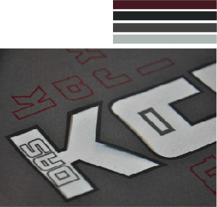
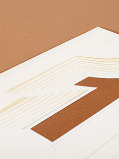
Close up of the die-cut & associated colour scheme
The colour palette for this die-cutted book cover is an intentional combination of dark greys with a subtle contrast of maroon to add contextual relevance to the author's german nationality as well as his marxist (and slightly industrial) outlook. The type used to describe the stout rigidity of marxismis accomplished by using Bolt Bold ITC.
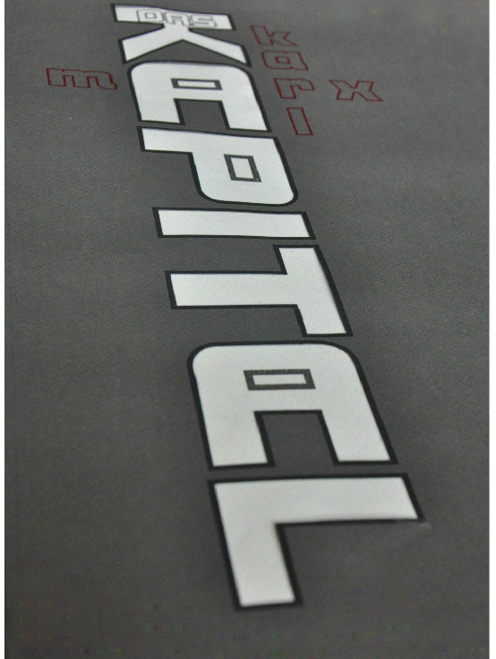
Final Outcome